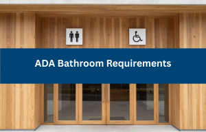
Creating accessible spaces starts with the basics—like clear, readable signage. For people with disabilities, especially those with visual or mobility impairments, properly designed ADA-compliant signs are essential tools for navigating buildings independently and safely.
Yet, many businesses unintentionally overlook key details of ADA sign requirements, leading to non-compliance, user frustration, and even legal consequences. In this guide, we’ll explore common mistakes businesses make with ADA signage and how you can avoid them through inclusive, compliant design.
Why Proper ADA Signage Matters
Accessible signage isn’t just about compliance—it’s about ensuring everyone can access information and spaces equally. ADA-compliant signage includes tactile elements, Braille, proper contrast, and specific mounting heights to support individuals with visual and physical disabilities.
Beyond that, the Americans with Disabilities Act (ADA) mandates signage requirements for many types of spaces in public buildings, healthcare facilities, educational institutions, and commercial environments. Failing to comply can lead to lawsuits, fines, and poor customer experience.
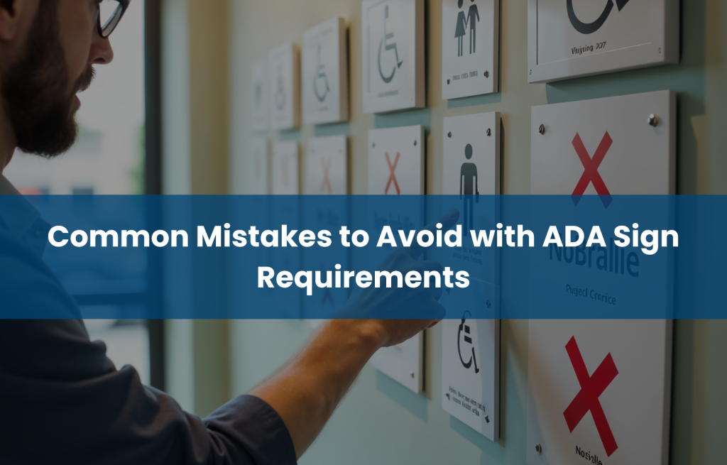
Mistake 1: Using Incorrect Fonts and Text Styles
One of the most common ADA signage mistakes is using stylized or decorative fonts that are difficult to read. ADA standards require simple, sans-serif fonts with appropriate letter spacing and height for tactile readability.
Avoid:
- Italics or script styles
- Tight kerning
- ALL CAPS (unless used consistently and appropriately)
Correct typography improves legibility for everyone, not just individuals with disabilities.
Mistake 2: Ignoring Braille or Using Incorrect Braille
All ADA-compliant signs identifying permanent rooms or spaces must include Grade 2 Braille. Yet, businesses frequently:
- Omit Braille completely
- Use incorrect spacing or flat dots
- Misplace the Braille text
Braille must be located directly beneath the corresponding text and must be tactile and domed, not printed or engraved too shallowly.
Mistake 3: Poor Contrast Between Text and Background
Low-contrast text blends into the background, especially for users with low vision or color blindness. ADA-compliant signs require a contrast ratio of at least 70% between the lettering and background.
Avoid:
- Gray on silver
- Yellow on white
- Blue on black
Use matte finishes to reduce glare and enhance readability.
Mistake 4: Incorrect Sign Mounting Height and Location
Mounting your sign in the wrong place makes it unusable. According to ADA sign height requirements:
- Signs must be mounted between 48–60 inches from the ground to the bottom of the tactile characters
- They must be placed on the latch side of the door, not the center
Failure to do so renders signs inaccessible to individuals using wheelchairs or white canes.
Mistake 5: Overlooking Pictogram Requirements
Pictograms (e.g., for restrooms or elevators) must be in a 6-inch high field, clear of text or Braille. Yet many signs:
- Overlay Braille over icons
- Shrink the pictogram field
- Use non-standard or unclear symbols
Clarity and consistency are critical to help users quickly understand the symbol’s meaning.
Mistake 6: Using Non-Durable or Glare-Prone Materials
Shiny or flimsy signs quickly become unreadable or non-compliant. ADA-compliant signs must use non-glare materials and durable construction, especially in high-traffic areas or where cleaning agents are used frequently.
Choose materials like:
- Matte acrylic
- Brushed metal (non-glare)
- Engraved plastic with tactile lettering
- Mistake 7: Neglecting Updates to ADA Standards
ADA sign requirements evolve over time. If your signs were installed years ago, they might not be compliant with current rules.
For example:
- Older signs may lack tactile features
- Braille formatting might be outdated
- Mounting heights or symbol placements may not meet today’s codes
Routine accessibility audits are critical to keeping your facility up to standard.
Best Practices to Ensure ADA Sign Compliance
To avoid these pitfalls, follow these best practices:
- Partner with a qualified ADA compliance consultants
- Conduct regular signage audits
- Train staff on signage requirements
- Use vendors experienced in ADA signage
- Refer to 2010 ADA Standards for Accessible Design
Need help? Accessibility Innovations offers audits and consulting to ensure your signage meets all current federal and local requirements.
Conclusion: Accessibility Starts with Proper Signage
Accessible signage is more than a legal checkbox—it’s a statement of inclusion. Getting your signs right means enabling people with disabilities to move confidently and independently through your spaces.
Don’t leave compliance to chance. Contact Accessibility Innovations today to review your signage and ensure you’re meeting all ADA sign requirements.
Frequently Asked Questions (FAQs)
What are the basic ADA sign requirements?
ADA signs must include tactile characters, Braille, high color contrast, and be mounted at an accessible height. These apply to permanent room identifiers, exits, and more.
Do all signs need to include Braille?
No. Only signs identifying permanent spaces like restrooms, offices, and exits need Braille. Directional or temporary signs do not.
Where should ADA signs be mounted?
Signs should be installed 48–60 inches from the floor, on the latch side of the door, and positioned for clear visibility and tactile reach.
Are there specific color/contrast rules?
Yes. A 70% contrast between text and background is required. Signs must also have a non-glare finish.
What happens if my signs aren’t compliant?
You could face fines, lawsuits, or accessibility complaints. Non-compliant signage also creates barriers for customers and employees with disabilities.
How can I upgrade non-compliant signage?
Start with a signage audit by accessibility consultants. Replace outdated or incorrect signs with ADA-compliant versions based on current standards.